How to Choose the Right Website Template
Template Details
| Responsive | No |
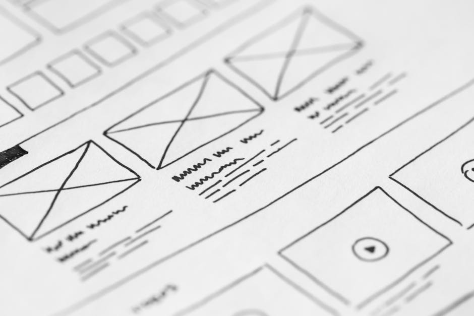
Photo by picjumbo.com on Pexels
The Template Trap: Why Picking the Wrong One Costs You
Choosing a website template feels like an easy decision — you browse a gallery, find something pretty, and download it. But picking the wrong template can hurt your search rankings, confuse your visitors, and even lose you sales. With thousands of templates available, making an informed choice is essential.
This guide walks you through a practical framework for selecting the right website template, whether you are building a business site, an online store, or a personal blog.
Step 1: Define Your Website’s Purpose First
Before you even open a template gallery, write down the primary goal of your website. Different types of sites need different layouts:
- Lead generation sites need prominent contact forms and clear calls to action above the fold.
- Ecommerce stores need product grids, cart functionality, and checkout pages.
- Portfolio sites need large image displays and minimal distractions.
- Blog and content sites need excellent typography and readable article layouts.
- Membership or course platforms need login areas, progress tracking, and gated content sections.
Choose a template designed for your specific use case, not a generic one you plan to force into shape. A multipurpose template can work, but a purpose-built template will always serve your visitors better.
Step 2: Evaluate Mobile Responsiveness Thoroughly
Over 60 percent of web traffic now comes from mobile devices. Google uses mobile-first indexing, meaning it judges your site based on the mobile version first. A template that looks stunning on desktop but breaks on mobile will kill your search visibility.
When evaluating a template, open it on your phone or use browser developer tools to test at multiple screen widths. Check that:
- Navigation menus collapse properly into hamburger menus
- Images scale down without cropping important content
- Buttons and links are large enough to tap with a finger
- Text remains readable without zooming
- Forms are usable on small screens
If the template demo page itself is not mobile-friendly, walk away. The final product will only be worse.
Step 3: Check Page Speed and Performance
A beautiful template is useless if it loads slowly. Page speed directly affects both user experience and Google rankings. Bloated templates with excessive animations, large image files, and unnecessary JavaScript libraries can add seconds to your load time.
Before committing, run the template demo through Google PageSpeed Insights or GTmetrix. Look for:
- Total page size under 2 MB ideally under 1 MB
- DOM size reasonable (under 1500 nodes)
- Minimal external script requests
- Proper image optimisation and lazy loading support
- Clean, efficient CSS without unused styles
Step 4: Assess Customisation Flexibility
Some templates are easy to customise while others require fighting against the original design. Check the following before choosing:
- Documentation quality: Does the template come with clear instructions for making changes?
- Code comments: Are the HTML and CSS files well-commented so you know what to modify?
- Colour and font options: Can you easily change the colour scheme and typography?
- Layout flexibility: Can you rearrange sections without breaking the design?
- Plugin compatibility: Does it work with the tools you plan to use?
If you are not a developer, look for templates that offer customisation through a visual interface or a theme options panel. If you are comfortable editing code, well-structured files with comments are more important.
Step 5: Verify Browser and Device Compatibility
A professional template should display consistently across Chrome, Firefox, Safari, and Edge. It should also work on different operating systems and device types. Test the demo on as many browsers as you can, or use a cross-browser testing tool.
Pay special attention to interactive elements like forms, sliders, and dropdown menus. These are the components most likely to break in different environments.
Step 6: Review SEO-Friendliness
Some templates are built with SEO best practices in mind while others are not. Look for these SEO-friendly features:
- Semantic HTML5 structure with proper heading hierarchy (h1, h2, h3)
- Clean URL structures
- Schema markup support for rich snippets
- Fast loading architecture
- Meta tag and Open Graph support for social sharing
A template that ignores SEO will make it much harder to rank your website, no matter how good your content is.
Step 7: Read Reviews and Check Support
Before downloading, search for reviews of the template and its developer. Good signs include active community forums, regular updates, and responsive customer support. Red flags include abandoned templates, unresolved bug reports, and developers who do not respond to questions.
If the template is from a reputable marketplace like ThemeForest or TemplateMonster, check the average rating and read recent reviews. Pay attention to any recurring complaints about compatibility or performance issues.
Final Checklist Before Downloading
Ask yourself these final questions before making your choice:
- Does this template match my brand’s visual identity?
- Will it work for my specific business type?
- Is it mobile-responsive and fast-loading?
- Can I customise it without hiring a developer?
- Is it regularly updated and well-supported?
- Does it include the pages and sections I actually need?
If you answer yes to all six, you have found your template. Take the time to evaluate properly upfront, and you will save hours of frustration and rework down the line.