Responsive Design Checklist: Make Your Website Template Mobile-Friendly
Template Details
| Responsive | No |
Responsive design is no longer optional—it’s a ranking factor and a user expectation. If your website template isn’t mobile-friendly, you’re losing up to 60% of potential visitors. This checklist gives you a clear, actionable path to ensure every template you build or buy works flawlessly on any device. From fluid grids to touch targets, here’s your complete guide to responsive web design.
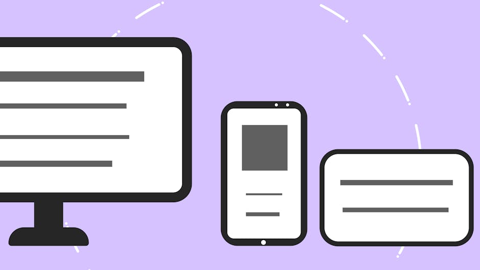
Photo by Monstera Production on Pexels
## Why Mobile-First Matters for Your Templates
Over half of global web traffic comes from mobile devices. Google uses mobile-first indexing, meaning it ranks your site based on its mobile version. A non-responsive template leads to high bounce rates, poor conversions, and lost revenue. For template sellers and designers, responsiveness is the baseline expectation, not a bonus.
### The Cost of Ignoring Responsiveness
- User frustration: Tiny text, overlapping elements, and horizontal scrolling.
- SEO penalties: Lower rankings on mobile search results.
- Lost sales: 88% of users won’t return after a bad mobile experience.
## The Complete Responsive Design Checklist
Use this checklist step-by-step when testing or building your website templates. Mark each item complete before launch.
### 1. Fluid Grid Layout (Foundation)
Use relative units (%, em, rem, vw) instead of fixed pixels for widths.
Set a max-width container (e.g., `max-width: 1200px`) to prevent stretching on large screens.
Implement CSS Grid or Flexbox for flexible column arrangements.
Test with content that expands (e.g., long text, large images).
### 2. Flexible Images and Media
Apply `max-width: 100%` and `height: auto` to all images.
Use `srcset` and `
Compress images to under 100KB for mobile speed.
Avoid fixed-width iframes; use `aspect-ratio` CSS property for videos.
### 3. Touch-Friendly Navigation
Make clickable elements at least 48x48px (Apple/Google guideline).
Space out menu items to prevent accidental taps.
Use a hamburger menu or off-canvas navigation for screens under 768px.
Test dropdown menus with a finger tap (not hover).
Photo by Andrea Davis on Pexels
### 4. Readable Typography Without Zoom
Set base font size to 16px minimum on mobile.
Use `clamp()` for fluid typography (e.g., `font-size: clamp(1rem, 2vw, 1.5rem)`).
Line height between 1.5 and 1.8 for body text.
Avoid text blocks wider than 80 characters per line.
### 5. Optimized Forms and Inputs
Single-column forms on mobile (no side-by-side fields).
Use `inputmode` and `type` attributes (e.g., `type=”tel”` for phone numbers).
Large, padded input fields with clear labels above (not inside).
Submit buttons that are easily tappable with one hand.
### 6. Performance and Speed
Lazy load images below the fold.
Minify CSS, JavaScript, and HTML.
Keep total page weight under 1MB for mobile.
Use browser caching and CDN for template assets.
## Mobile-Friendly vs. Responsive: What’s the Difference?
| Feature | Mobile-Friendly | Responsive Design |
|---|---|---|
| Layout | Separate mobile site (m.example.com) | Same HTML, CSS adjusts |
| URLs | Different URLs | Same URLs |
| Maintenance | Requires updating two sites | Single codebase |
| SEO | Can cause duplicate content issues | Preferred by Google |
| Flexibility | Fixed for specific devices | Adapts to any screen size |
| Example | Old Facebook mobile site | Modern Bootstrap templates |
Verdict: Always choose responsive design. It’s easier to maintain, better for SEO, and future-proofs your template.
## Common Responsive Design Mistakes (And Fixes)
Even experienced designers slip up. Here are the top 5 mistakes to avoid:
### Mistake 1: Fixed-Width Elements
- Problem: A sidebar or image set to `width: 300px` overflows on small screens.
- Fix: Use `max-width: 100%` and let content reflow.
### Mistake 2: Overusing Breakpoints
- Problem: Creating breakpoints for every device (iPhone 12, Galaxy S21, etc.).
- Fix: Use 3-4 breakpoints: 480px, 768px, 1024px, 1200px. Let the layout flow naturally.
### Mistake 3: Hiding Content Instead of Adapting
- Problem: Using `display: none` on mobile to remove important sections.
- Fix: Restructure content vertically; don’t delete it.
### Mistake 4: Ignoring Touch vs. Click
- Problem: Hover-based interactions that don’t work on touchscreens.
- Fix: Use `@media (hover: hover)` for hover effects, or add fallbacks.
### Mistake 5: Not Testing Real Devices
- Problem: Only using browser dev tools (which can be inaccurate).
- Fix: Test on actual smartphones and tablets, or use real-device testing services.

Photo by Negative Space on Pexels
## How to Test Your Template’s Responsiveness
Don’t rely on guesswork. Use these tools and methods:
### Browser DevTools (Fast Check)
- Open Chrome DevTools (F12) and toggle device toolbar.
- Test at 375px (iPhone), 768px (iPad), and 1024px (small laptop).
- Check for horizontal scrollbars, overlapping text, and broken layouts.
### Online Testing Tools
- Google Mobile-Friendly Test: Free tool that checks if your page passes mobile usability.
- BrowserStack: Cross-browser and device testing (paid, but comprehensive).
- Responsinator: Quick preview on popular devices.
### Manual Testing Checklist
Scroll vertically without horizontal scroll.
Tap all buttons and links with finger.
Zoom in/out—content should reflow.
Rotate device—layout should adjust.
Test on slow 3G network (use Chrome throttling).
## Final Step: Make Your Template Responsive by Default
When building or customizing a template from PageBuild.store, start with a mobile-first CSS approach. Write styles for small screens first, then add `@media (min-width: …)` for larger screens. This ensures your template works out of the box on all devices.
Pro tip: Use a CSS framework like Bootstrap 5 or Tailwind CSS to speed up responsive development. Most PageBuild.store templates already include these frameworks—just customize and go.
## Conclusion and Next Steps
Responsive design isn’t a one-time fix—it’s an ongoing commitment to user experience. By following this checklist, you ensure your website templates load fast, look great, and function perfectly on every screen. Start with mobile, test relentlessly, and never sacrifice usability for aesthetics.
Ready to launch a responsive website without coding from scratch? Visit PageBuild.store today to browse our collection of premium, fully responsive website templates. Every template is tested across devices, optimized for speed, and ready to customize. Stop rebuilding—start scaling.